What design choices did you make and why?
1. Design Decisions: What design choices did you make and why? There was so much ay way I could have taken my Interactive Field Guide. I wanted part of it to have a cohesive look and feel while still flexing professional and tied to the game. The colors are very import to this site. The Green, Blue, and Yellow actually represents actual colors from the game. The demand bar are those colors and I thought they would be a nice touch to add to the Interactive Field Guide. The typography I wanted the Headers to feel more fun and bubbly while still being able to read them. The body I wanted to use a nice san-serif that would complement the content and the headers.
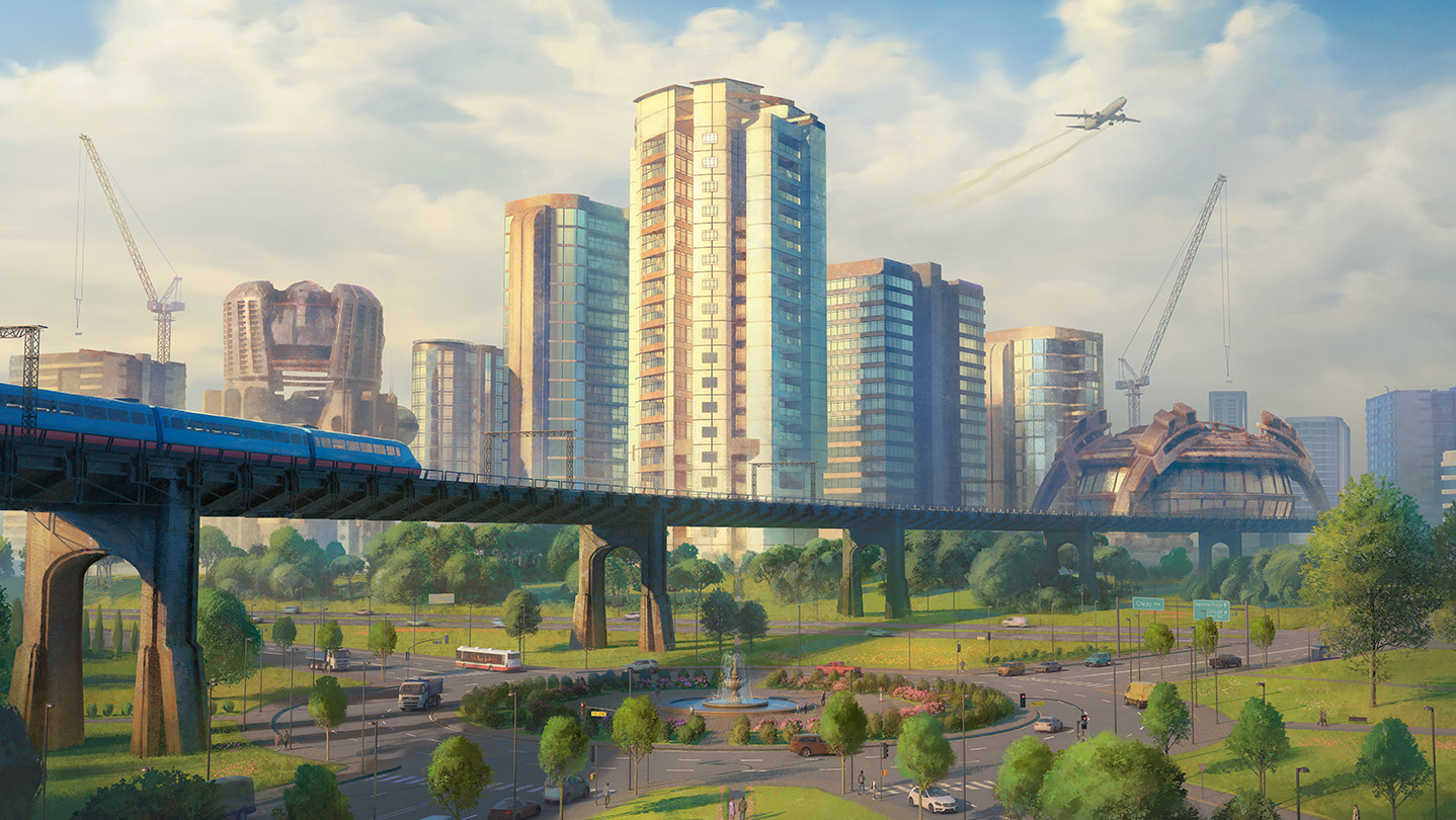
From previous examples there was no images included with the Interactive Field Guide, so I wanted to add some to give art a nice visual touch to see what the game “Cites Skylines,” looks like and what your getting your self prepared for while reading the Interactive Field Guide. The hero image I was Abel to find the background image from the actual game in the App Store, and have the logo pop off the background into the main content which I feel gives a nice look. The sidebar I wanted to have to have it centered in the page intend of taking up the whole side. Lastly, the Decor elements I wanted to use real icons that’s are used n the game to give it a nice touch and cohesive feel to the game.
What was difficult to code? How did you solve it?
There was so much difficulty getting things to work. The biggest challenge I was running into was making the nav bar fold and having to use a hamburger menu to open the nav bar when going into mobile.
I spent a couple hours trying to figure it out. I had the basic layout done but it still wasn’t working. The top side bar wasn’t showing up correctly and the hanger menu was allowing it to open up. I then was able to have Claude help me figure out what I did wrong, There was just one writing mistake and was missing a important part for allowing the side bar to connect to the responsive design from laptop to mobile.
How did you adapt your design for mobile?
From the responsive design strategy. I wanted to have everything included within the shrinking to mobile.The only thing that I didn’t include was deco elements. I think they became distracting when struck to mobile. During in the media area of the CSS I had to add some different margins, and help with positioned absolute elements to make them line up.
The nav bar was also the biggest thing to change and was trying to figure to how to change nav bar to a hamburger menu you have to click to get the nav bar to pop up to select a section. The responsive design part is still something that needs a little work on but overall works and has a pretty polished design.
What did you learn about Flexbox or CSS positioning?
There was a ton of learning moments throughout the whole design process of designing the Interactive Field Guide. The Flexbox I was Abel to figure out way better this time. I was Abel to set up a two column way easier. The thing that I like about Flexbox is how easy it is to adjust content and where content goes while keeping in the container. CSS position I would say I used Position: Absolute the most throughout this design and it goes you the freedom to move objects around and position them here you need them.
What would you add or change with more time?
IThere are some future improvements that I would like to do to this design, There are a couple things that I would like to add such as some different Deco Items, and adding one different images. The things I would change would be the nav bar in the mobile version. I want to add some elements and make it look better than just plain blue. I also would like to edit the bullets to make them more personal to the design and to “Cities Skylines.” I would like to go back through my code and make sure everything is polished and looks professional. Overall, I think this is a pretty good design but there are future improvements that I would like to add and change.